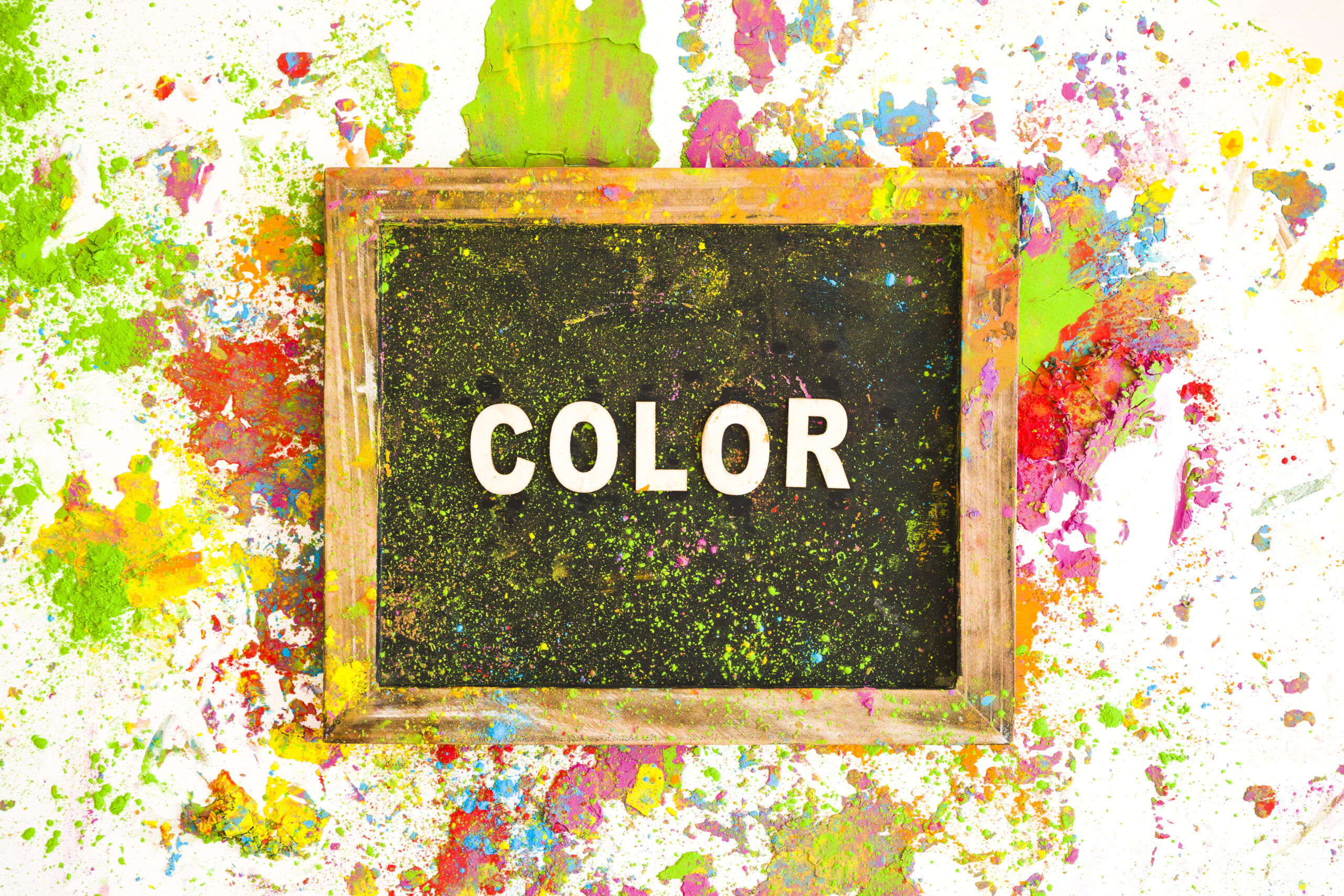
Colour: The Heartbeat of Graphic Design
In the vibrant world of graphic design, colour reigns supreme. It’s not just a visual element; it’s a powerful communicator, a mood-setter, and a brand-builder. Understanding the importance of colour in graphic design is like unlocking a secret language that speaks directly to the viewer’s emotions and perceptions.
Let’s dive into the kaleidoscope of reasons why colour matters so much in graphic design:
- First Impressions Count
Imagine walking into a room painted entirely in bright red versus one in calming blue. Your immediate reaction would be vastly different, right? That’s the power of colour at work. In graphic design, colour is often the first element that catches the eye, making an instant impression before any text is read or images are fully processed. It’s your design’s handshake, setting the tone for everything that follows.
- Emotional Resonance
Colors are emotional chameleons. They have the uncanny ability to evoke specific feelings and moods. Want to create a sense of trust and reliability? Blue might be your go-to. Aiming for energy and excitement? Red and orange could be your dynamic duo. By strategically choosing colours, designers can tap into the viewer’s emotions, creating a connection that goes beyond the visual.
- Brand Identity and Recognition
Think golden arches, and you’re likely picturing a certain fast-food giant. That’s the power of colour in branding. Consistent use of colour across all brand materials creates a visual shorthand that customers come to recognize and associate with your brand. It’s not just about looking pretty; it’s about building a memorable brand identity that sticks in the minds of consumers.
- Guiding the Eye
In the intricate dance of graphic design, colour acts as the choreographer, guiding the viewer’s eye across the composition. By using contrasting colours or strategic pops of bright hues, designers can highlight key information, create focal points, and lead the viewer on a visual journey through the design.
- Conveying Information
Colour isn’t just decorative; it’s informative. In infographics, charts, and data visualizations, colour helps categorize information, making complex data more digestible and understandable at a glance. It’s a visual shortcut that can convey meaning faster than words alone.
- Cultural Considerations
The meaning of colours can vary dramatically across cultures. What’s considered lucky in one country might be associated with mourning in another. For designers working on global projects, understanding these cultural colour associations is crucial to avoid unintended messages and ensure your design resonates positively with its intended audience.
- Accessibility and Readability
Colour choices can make or break the accessibility of your design. Proper colour contrast is essential for readability, especially for viewers with visual impairments. Smart use of colour can enhance the legibility of text and the overall usability of your design, making it inclusive and effective for a wider audience.
- Trend and Timelessness
While colour trends come and go, understanding how to use colour effectively is a timeless skill. Savvy designers know how to balance trendy colour palettes with classic combinations, creating designs that feel fresh yet have staying power.
- Psychological Impact
The psychology of colour is a fascinating field that intersects with graphic design in powerful ways. Colours can influence perceptions of time, affect appetite, and even impact purchasing decisions. By leveraging colour psychology, designers can subtly influence user behaviour and decision-making processes.
- Harmony and Balance
Creating a harmonious colour palette is an art form in itself. The right combination of colours can bring balance and cohesion to a design, making it visually pleasing and effective. Whether it’s through complementary colours, analogous schemes, or monochromatic palettes, the thoughtful use of colour creates designs that are both beautiful and functional.
In conclusion, colour is far more than just a decorative element in graphic design. It’s a fundamental tool that, when wielded with skill and understanding, can elevate a design from good to unforgettable. As designers, embracing the power of colour means tapping into a world of possibilities, creating visual experiences that not only catch the eye but also touch the heart and mind of the viewer.
So, the next time you’re working on a design project, remember: you’re not just choosing colors; you’re selecting emotions, crafting identities, and shaping perceptions. Use this power wisely, and watch your designs come to life in vivid, impactful ways.
Image attribution: Freepik